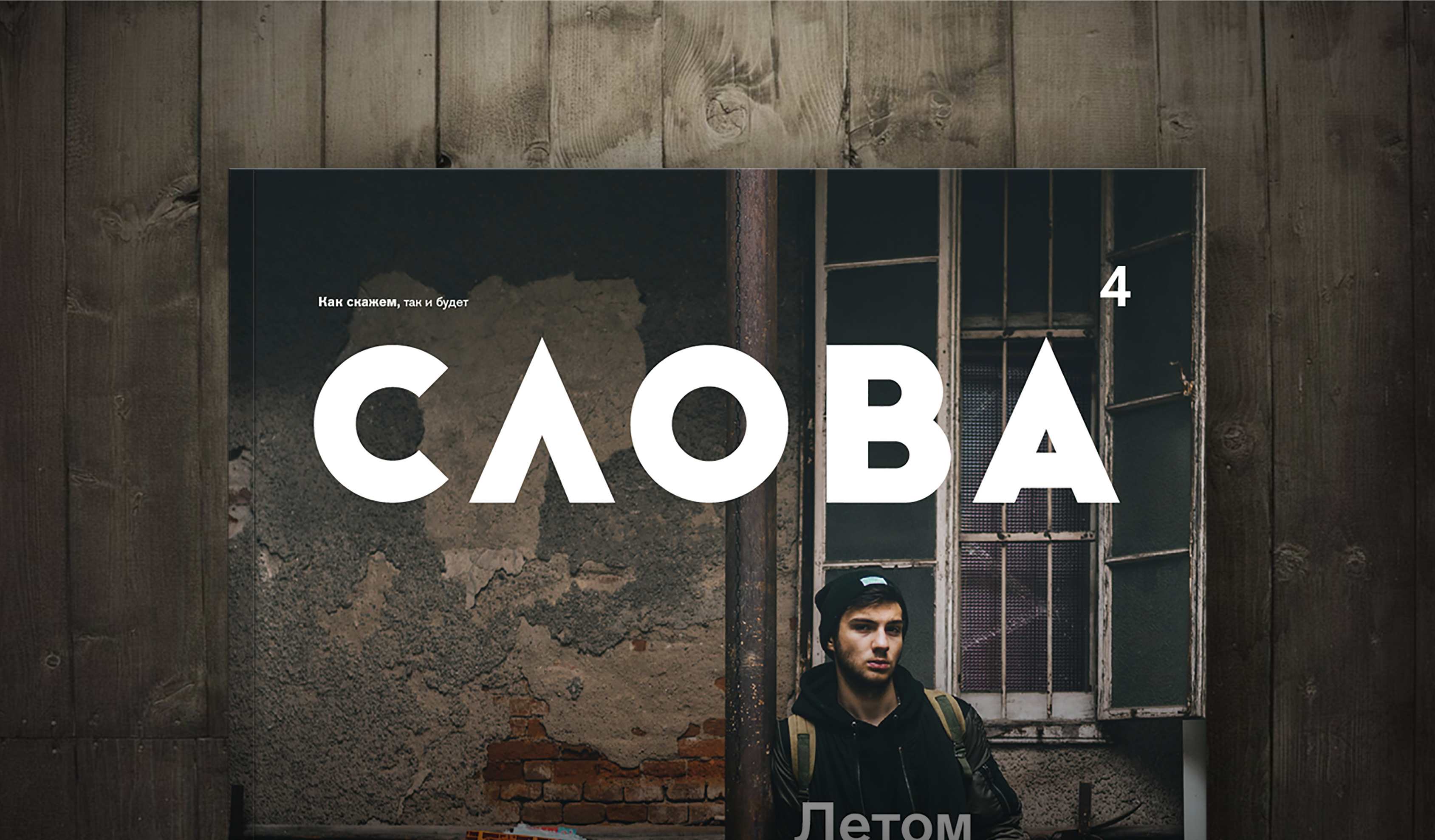
The word "slova" that did not fit on the magazine cover. We suggested making a hyphen a mascot of the entire project as a symbol of something that lasts, a process between the beginning and the end. The title was going to have a lot more than just letters behind it — It represented one month of the city life. So hyphen was a symbol of the unsaid that did not fit on the cover.

Modern geometric grotesque without unnecessary drama and mystery. It leaves a lot of room for creativity and serves as a simple, but solid foundation. Big John font was used as the basis for this logo.

Letters form words, words make up sentences and sentences tell the story. The idea to call the magazine Slova (The Words) focuses the reader's attention on the content and its meaning. In this version we proposed to highlight just the first letter and make it large and contrasting. We wanted to convey the idea of focus and concentration.

Thin and thick strokes create contrast. There has to be contrast in order for something to happen. Wind is caused by differences in atmospheric pressure, a ball starts to roll due to height difference. Events are generated by tension and hypermotivation. Slova is about events, motivation and contrast.


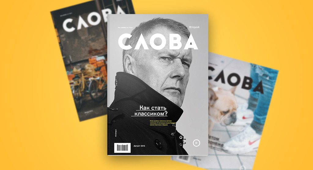
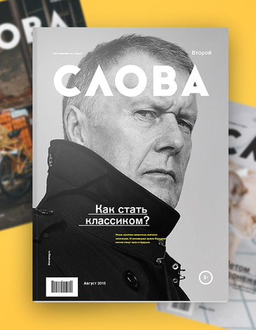
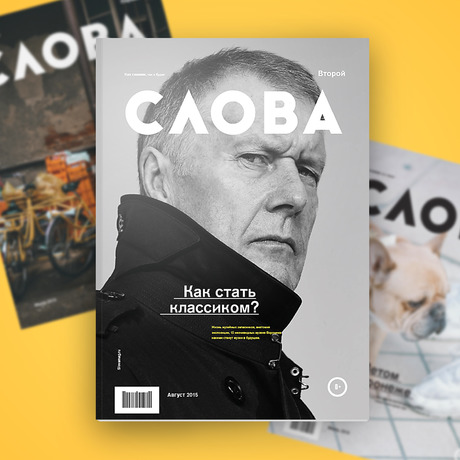
Number four: Cover
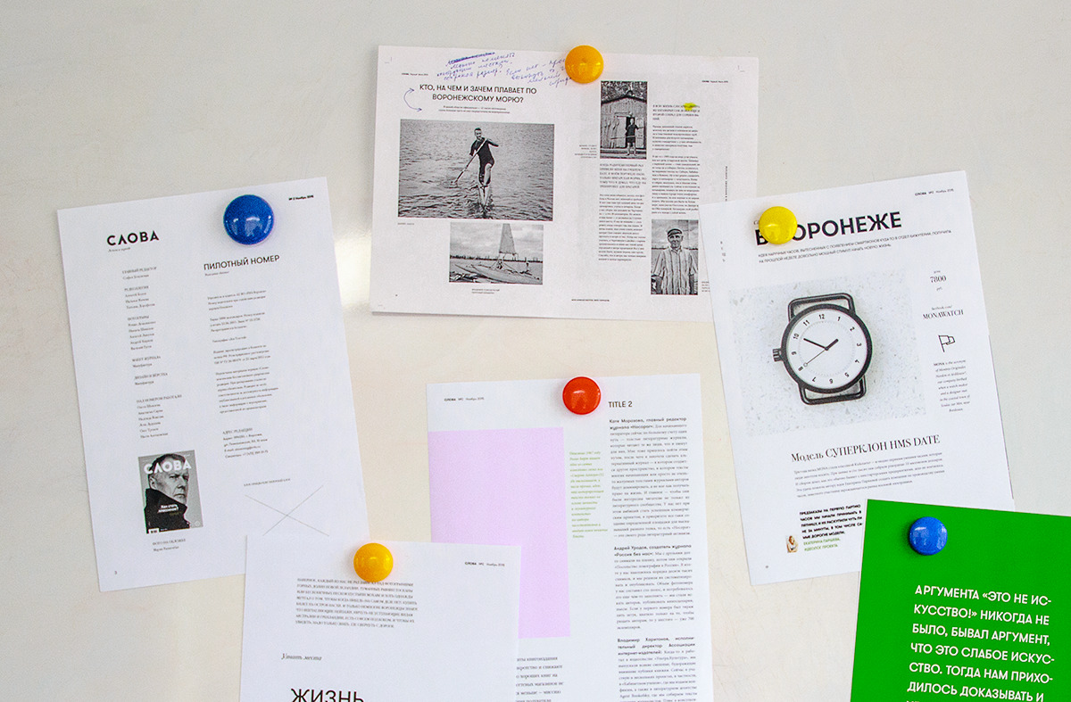
We looked at several cover design options, both classic and fluorescent. The idea of a paddle cutting through the water of the "Voronezh sea" seemed bold and appropriate at the same time. However, the classic one was selected. We were ready for it tough; we never suggest options that we don’t want to be chosen.

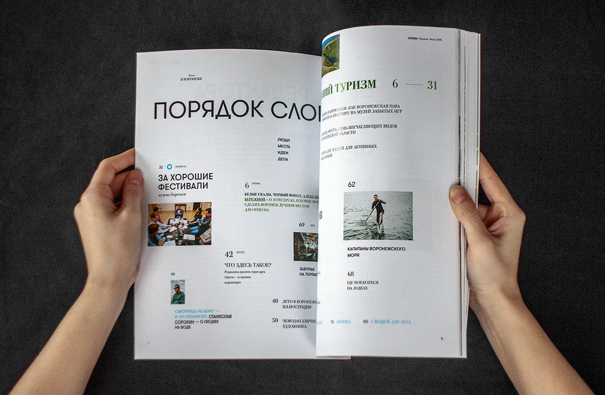
Instead of numbering magazine issues with figures we used words, for instance "First" instead of "No.1". It suits the magazine title very well. There are so many ways you can play with it: "from words to deeds", "you have my word", "as good as one's word", "beyond words" and so on.


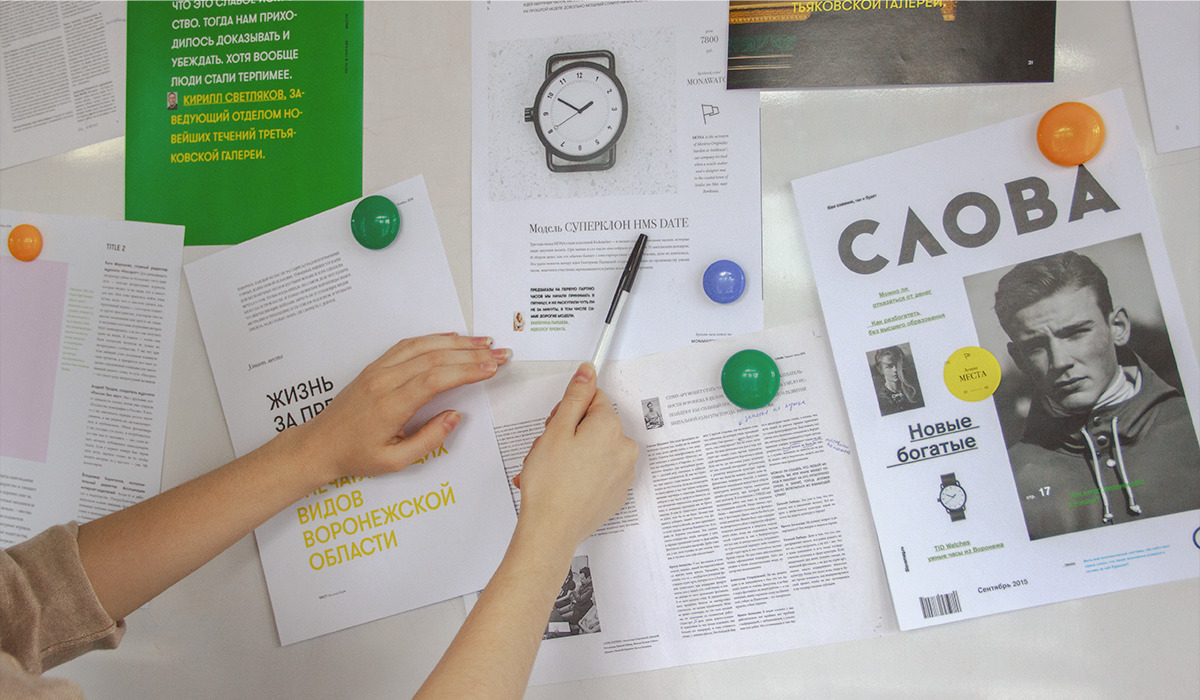
We often take on tasks that we are not familiar with. Like navigational signage for the Voronezh Chamber Theatre or design of Slova magazine, which was our first experience of designing a printed magazine. Our work finds an echo in people’s hearts and we get new contracts, rewards and a little bit of fame. Each unfamiliar task extends our competences and sharpens our skills. A sense of responsibility inspires us to do the work the best we can. Sometimes we pay a high price for it, but it’s totally worth it.

Customer review
"Being a government institution we had certain criteria when selecting a design studio for our project. Our goal was to make one of the best magazines in Voronezh, so we looked at several studios including the ones from Voronezh and some of the best design studious in Russia. We selected Manufactura because of many high quality projects in their portfolio. Manufactura is one of the best and most famous studios in Voronezh. Yet they offered us a lower price than Moscow studios did.
The magazine turned out very stylish. Many people note that its design is not inferior to the works of famous Moscow studios. The only complaint I may have is that we didn’t receive the guidelines we expected. But overall we are very happy with the result. The magazine looks cool and trendy."

Sofia Yartseva,
Chief Editor